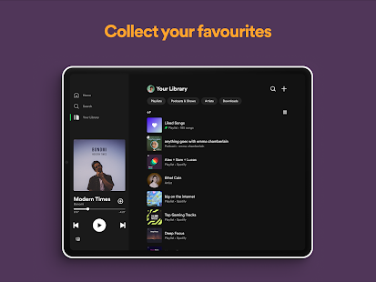

Through a new post on its official blog, we found that the popular music streaming platform launched a redesigned version of the “Your Library” page for the mobile app.
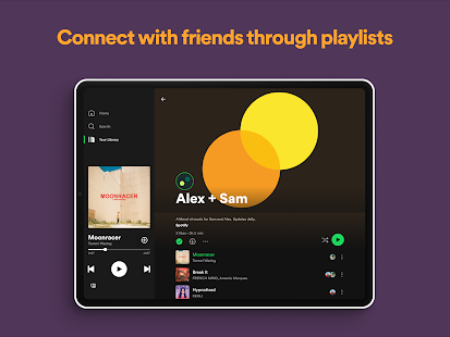
The new design seeks to facilitate the exploration of users by their music collection, also unifying with the podcasts that the user follows. The platform hopes that this change will help save time when searching for content and organizing its collection.
Check the list of changes:
- A more linear way to browse and search your entire collection – music, and podcasts – in one place.
- New dynamic filters to help you navigate through a particular collection. Choose between album, artist, playlist, or podcast to see if the audio you saved with that profile. So, if you’re ready, hit the Downloaded filter to filter your view of all the content available offline at once.
- Better choice options. Choose to see your audio alphabetically, recently played, or by creator name. Now, this is organized.
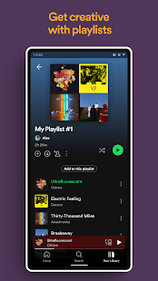
- More control and easy access to what you’re listening to the most. Choose up to four playlists, albums, or podcasts to keep pinned to the “pin” option.
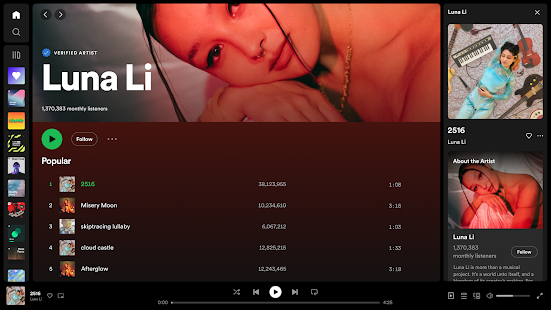
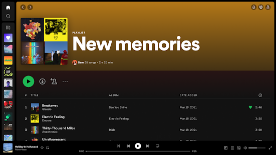
- Use the new Grid view to browse saved content in a more visual way, with a large album title, playlist, and podcast cover art.
The update will be distributed over the next week to Android and iOS users.
After tests, Spotify releases an update that brings a new look to the app’s library
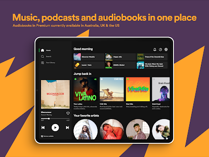
Yesterday (22), Spotify published an official note on the company’s blog to publicize the news that is being implemented with the latest update of the music app. With that, users will have access to a completely readjusted home interface, focusing on making navigation even simpler.
This implementation has been in the testing phase for some time, but only now comes in the stable version of streaming audio, making it possible for the homepage to have customizations that help to identify the musical profile of each one.
According to the company, the localization of audios will become even easier, in practice, Android and iOS users will be graced with these changes, and the release for the whole world will start later this month.
- Travel back in time: rediscover lost jewelry in your listening history with a new “recently played” destination, where users can go back in time and browse up to three months of their listening history. Premium and free users worldwide will be able to browse individual tracks and episodes that have recently been played, as well as playlists, albums, and programs from which they have been played.
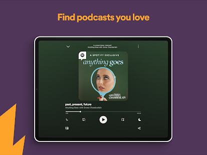
- Go to new and unfinished podcasts: premium users can view new and relevant podcast episodes directly from the Home hub, new episodes will be marked with a blue dot, and episodes that have already started will display a progress bar indicating how advanced you are at the episode.
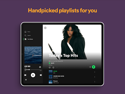
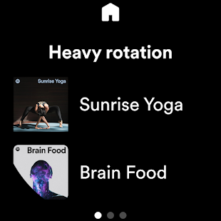
- Discover more music: premium users worldwide will not miss a single track by the artists they love. You will now see a new surface highlighted at the top of the Home hub, dedicated to discovery-oriented recommendations that are personalized, timely, and related to your taste.
Spotify starts testing the new look of the library in the Android app version
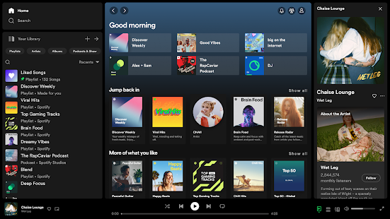
This week, Spotify began testing a major change in the look of the library screen in its version of the Android application. According to screenshots obtained by the Android Police team, this appears to be the biggest change in the user interface in the streaming service since 2019.
As of version 8.6.2.774 of the application for mobile phones with the Google operating system, a very limited group of users started to receive an update via a server that gives access to the change in the layout of the Spotify library.
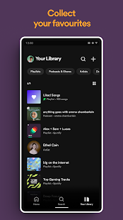
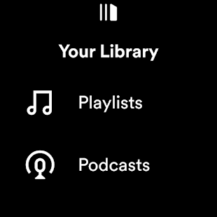
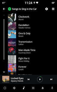
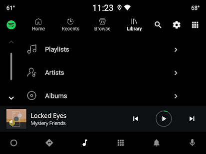
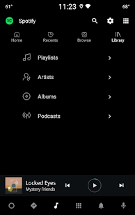
Currently, for those who have not yet received the update, the library is separated into two tabs, Music and Podcasts, with three more tabs – Playlists, Artists, and Albums. By default, the app already opens the library in the first option, which shows the playlists, and the user can switch views to highlight each category.
Now, with the trial version, the library will open in a general view, which will show a feed with all the options available for streaming, such as playlists, artists, albums, and podcasts, all mixed up. The options to switch and view only one type of content are still available, but with a more “minimalist” appearance, which activates a kind of “filter” to show the results. Check out the gallery below for the new application interface:
In addition to these new features, the application also allows the user to change the library view from the format in lists to the grid view. A new option to change the organization of the contents will also be available and will allow the user to change between “recently played”, “recently added”, “alphabetical order” and “Creator” both on the main screen and with “filters” activated.
Finally, a very interesting change is that the icon for creating a new playlist has been repositioned and, instead of appearing as an option at the top of the lists, there is now a “plus” sign in the upper right corner of the screen.
For now, there is no prediction of when – or at least if – this update will reach a larger group of people, so it is necessary to keep an eye on more news on the subject or any changes to the app. Spotify also announced last Tuesday (22) that by the end of the year it should implement a new playback mode for music on Hi-Fi, to give more quality to the audios.
Recommended: Huawei Mate 40 Pro Plus still supports Google services after upgrading to HarmonyOS